Choice Field
- 100%
- 6.0
- Enterprise
- Community
Planned
Overview
Choice Field is a multi-purpose field used to allow the user to choose one or more options. It can be rendered as a select tag, radio buttons, or checkboxes.
Details
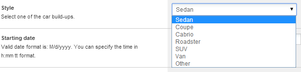
Choice field as a dropdownlist can be used just the same as a common html select. The options could have the standard properties like selected, disabled, label and value. Value and label properties and the text of the option could be localized.
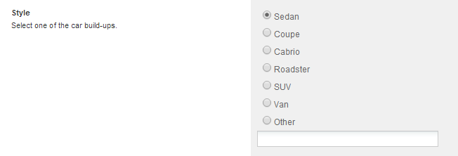
Choice field as a radiobuttongroup can be used as a list of common html radiobuttons. If you wanna customize them with css feel free to use InputMachinator.js.
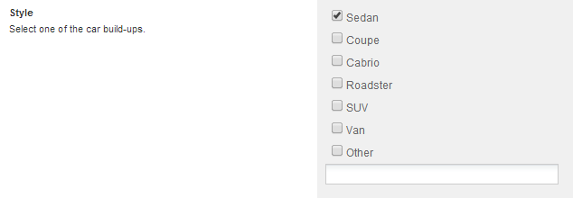
Choice field as a checboxgroup can be used as a list of common html checkboxes. If you wanna customize them with css feel free to use our InputMachinator.js.
The chosen option is indexed in the fulltext index by all its localized values and texts (so you can search by value or text) and indexed in field index by its value. If you wanna sort list items by a choice field, they will be ordered by the selected options value and the items with extravalue will be at the end of the list.
Enum options
The choice field can be built up using an Enumeration defined in source code.
<Options>
  <Enum type="SenseNet.Search.FilterStatus" resourceClass="MyResourceClassName" />
</Options>
In that case, you do not have to modify the CTD to localize the options of the field.
Field handler
- handler: SenseNet.ContentRepository.Fields.ChoiceField
- short name: Choice
Usage in CTD:
   <Field name="Data1" type="Choice">
   ...
   <Configuration>
      <Options>
          <Option value="1" selected="true">value 1</Option>
          <Option value="2">value 2</Option>
          ...
      </Options>
   </Configuration>
   </Field>
Supported Field Controls
- DropDown Field Control: a select box, which allows the user to choose one value from an option list.
- RadioButtonGroup Field Control: group of selectable radiobuttons.
- CheckBoxGroup Field Control: group of selectable checkboxes.
Configuration
The following properties can be set in the field's configuration:
- AllowMultiple: (optional) allows multiple selection.
- AllowExtraValue: (optional) allows to add an extra value to the field.
- DisplayChoices: (optional) specifies the type of the field control which will handle the current field ('DropDown','RadioButtons','CheckBoxes').
Example/Tutorials
Fully featured example:
<Field name="Style" type="Choice">
      <DisplayName>Style</DisplayName>
      <Description>This field contains the style of the car</Description>
      <Configuration>
        <AllowMultiple>false</AllowMultiple>
        <AllowExtraValue>true</AllowExtraValue>
        <Options>
          <Option value="Sedan" selected='true'>Sedan</Option>
          <Option value="Coupe">Coupe</Option>
          <Option value="Cabrio">Cabrio</Option>
          <Option value="Roadster">Roadster</Option>
          <Option value="SUV">SUV</Option>
          <Option value="Van">Van</Option>
        </Options>
        <DisplayChoices>RadioButtons</DisplayChoices>
      </Configuration>
</Field>
The above example configures the Choice field so that:
- it is not allowed to choose more than one option
- it is allowed to add an extra value
- there's a list of the options
- the field will be displayed as list of radiobuttons
